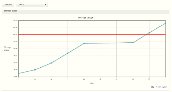
Might be a very simple thing to add, would be nice seeing it in the overview as the graph would be bouncing off of it.
Would also serve as a confirmation that given value was understood, as currently I can put in to input box “asdasdasd” and get no error or anything
Would be also nice seeing that 30% or 50% fall where you expect them to fall.
Would be like this maybe?